5 Design Tips for Professional Flyers
Flyers remain a crucial aspect of any advertising and cross-platform marketing campaign. You want it to grab the attention of your intended market and be memorable to them. Regardless of your brand identity or scope of business, your professional flyer should be designed with your target market in mind. With a strong visual image and a few key elements, you can significantly increase the likelihood your customers will respond.
Incorporate Tech Appeal Into Your Print Campaign
An increasing number of consumers interact with companies via websites and apps. These consumers expect information to be presented in a concise and clear manner that guides them to a course of action. Information on flyers can be easily absorbed with headings and sub-headings.
Be Friendly and Approachable
Modern consumers expect to be able to interact with companies and are more likely to do so if they feel an emotional connection to the brand. The language used in your flyers should be casual and friendly. High-quality images of business people and satisfied customers reinforce the idea that your business is approachable.
Be Bold With Visuals
Let your graphics and colors take center stage, but don’t compromise the quality of your text in the process. By reducing the opacity of parts of images and adding in subtle gradients, you can maintain the eye-catching quality of large images and still have content pop off the page.
Include a Call to Action
It costs you money to create a professional flyer design that gets attention. Once you do, guide customers in a clear direction to take immediate action. This can be accomplished by including your contact information, limited-time offers, discounts, and incentives to act right away. You have to give them something of value.
Example Templates
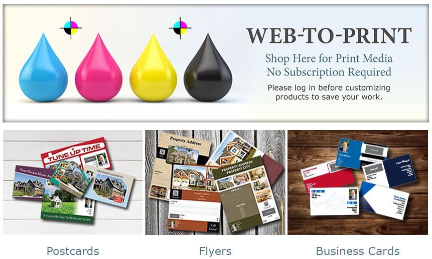
Need some examples or easy to use templates? Check out the ones in the Web To Print store. Or, if you already have yours designed, you can upload your own design and have them printed.


